Fixing Broken Website Image Links
How to solve missing product photos and broken image paths to maintain a clean, professional store layout.
Read Strategy
Best practices for clean, intuitive mobile menus and sticky cart features that users can navigate seamlessly.
You have spent thousands of dollars perfecting your conversion copywriting, stocking top-tier product varieties, and running hyper-targeted customer acquisition campaigns. Traffic is hitting your user dashboards and collection pages. But here is the brutal reality of modern mobile commerce: over 70% of global web traffic interacts with your brand through a smartphone touchscreen. If your account dashboard, primary filters, or checkout triggers require multi-finger stretching or complex multi-level drop-downs, mobile shoppers will abandon your funnel out of pure mechanical frustration.
The mistake many merchants make is taking desktop-centric navigation frameworks and simply squishing them onto a mobile portrait window. This lack of architectural planning results in cluttered hamburger menus, microscopic close buttons, and hidden checkout links that kill purchasing momentum. Designing an intentional mobile-first navigation flow—anchored by ergonomic thumb-zone positioning and persistent action buttons—radically simplifies the buyer's path. When navigating your retail store feels completely intuitive, user retention rates surge and cart abandonment drops dramatically.
At TY ALPHA, TECHNOLOGY, we build high-performance, mobile-responsive e-commerce systems tailored to real-world user habits. We have designed this layout manual to help you build clean mobile control panels, configure frictionless sticky carts, and optimize your checkout paths for international mobile buyers.
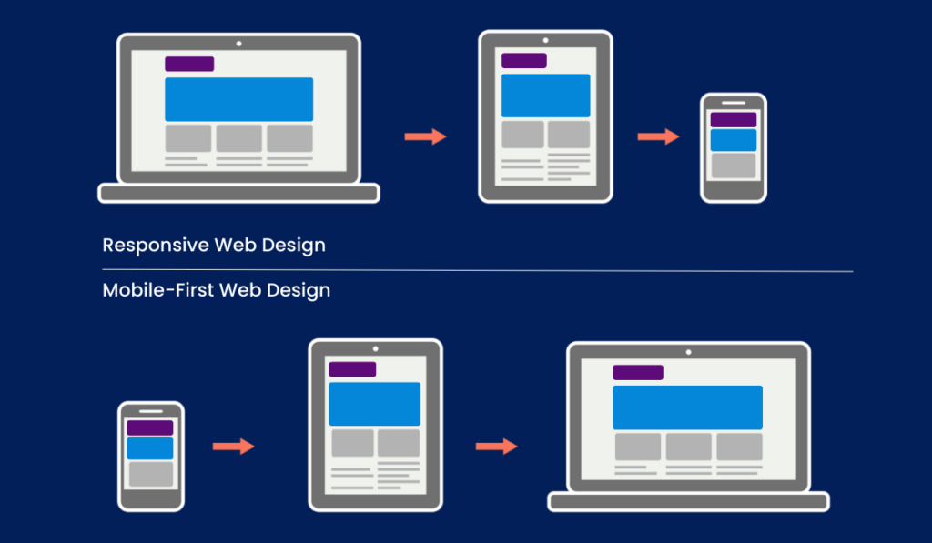
To seamlessly guide shoppers from account registration to order finalization without overwhelming small mobile displays, your layout must prioritize these core structural components:
Relying on generic, unoptimized themes or stacking multiple third-party slider plugins to handle your mobile menus compromises your store's stability. These uncoordinated script libraries slow down your site's main thread, introduce layout shifting during page rendering, and conflict with native mobile browser behaviors. A slow, glitchy navigation bar frustrates mobile buyers, causing them to bounce away from your store before your inventory can even load.
Building your mobile layout over a direct, native frontend pipeline completely eliminates this performance bottleneck. Utilizing hardware-accelerated CSS animations and lean JavaScript ensures that menu panels slide out smoothly and your sticky carts render with fluid precision. This performance-focused engineering reduces mobile device battery drain, satisfying modern mobile search index algorithms and keeping your prospects fully engaged throughout their checkout journey.
At TY ALPHA, TECHNOLOGY, we focus on writing clean, light frontend layouts that run seamlessly, keeping your mobile storefront menus running perfectly from day one.
Analyzing the technical factors that separate unoptimized mobile layouts from responsive, high-converting checkout interfaces:
| UX Design Factor | Desktop-First Adaptations | Purpose-Built Mobile Navigation |
|---|---|---|
| Ergonomic Layout | Places primary options at the top edge of screens, causing hand fatigue and navigation errors. | Focuses layout within the natural thumb-zone at the lower third of mobile screens. |
| Cart Access | Hides shopping carts inside standard top headers, forcing manual scrolling to check totals. | Features a persistent sticky cart bar that dynamically tracks user scrolling behavior. |
| Menu Logic | Relies on complex multi-tiered menus that are difficult to tap accurately on small viewports. | Uses single-layer off-canvas drawers with generous, touch-friendly tap targets. |
| Code Efficiency | Loads bulky layout engines that slow down browser parsing and create layout shifts. | Runs on lean, hardware-accelerated styles for instantaneous rendering. |
| User Engagement | High friction; users bounce due to confusing options and awkward search pathways. | Low friction; encourages deeper exploration, extending mobile user session durations. |
When you implement dynamic menus, live cart lookups, and account dashboards onto a mobile storefront, you integrate multiple event listeners into the browser layer. If these scripts are written poorly, they create input delay—making menu buttons feel laggy or unresponsive when tapped. This responsiveness delay breaks user trust, especially for shoppers browsing via variable mobile data networks where every kilobyte of data counts.
To protect your store's conversions, it is vital to combine accessible layout design with high-performance code. We focus on lightweight script files, native browser APIs, and clean asset mapping. This ensure that your menu items, slide-out panels, and multi-currency selectors trigger instantly on touch, providing cross-border buyers with a premium shopping experience.
Pairing an effortless user experience with a fast storefront setup gives your retail brand a massive competitive edge. Keeping your site code streamlined and your technical overhead low protects your marketing budget, optimizes your search engine rankings, and path-tracks customers directly to completed sales.
Relying indefinitely on rigid third-party marketplace templates means your e-commerce operation is highly vulnerable to unexpected layout or algorithmic changes. Long-term digital growth is secured when you establish an independent storefront that has complete ownership over its user experience, navigation design, and conversion metrics. While standard layouts can work for early discovery, a tailored, highly functional site is where customer lifetime value is nurtured and maintained.
When your fast mobile rendering speeds, intuitive interface layouts, and secure checkout processes run in total harmony, your marketing acquisition costs drop significantly. International buyers move through your catalog with ease, mobile purchases complete smoothly, and your brand authority grows naturally. Our engineering framework balances clean frontend systems with conversion optimization strategies to help you scale a secure digital platform.
To audit your site's mobile usability, eliminate interaction friction, and deploy fast, intuitive user dashboards safely, we follow a disciplined 6-step roadmap:
We review your active store interface on real mobile screens to discover hidden friction points, layout bugs, and tap delays.
We redesign your main category links, filters, and user profiles, moving them into a highly accessible bottom-screen layout.
We build a lightweight sticky cart and checkout trigger that follows user scrolling smoothly without covering critical product content.
We simplify complex multi-level menus into an elegant, single-layer screen drawer built for effortless mobile interactions.
We expand layout touch zones to meet international accessibility targets and optimize scripts for instantaneous button responses.
We run rigorous mobile speed diagnostics under simulated slow data networks, purge unused styling code, and confidently launch your new layout.
Transitioning from a basic webpage to a fully optimized, high-converting retail storefront is a major milestone—it is a bold step toward financial independence, brand recognition, and tapping into a global network of digital consumers.
Whether you are building on Shopify, WordPress, or developing a fully custom e-commerce system, we are here to support your growth. If you run into any technical layout conflicts, require assistance connecting complex international payment gateways, or want professional advice on accelerating your store’s loading speeds, we have you covered. The team at TY ALPHA, TECHNOLOGY specializes in keeping digital architecture clear, simple, and perfectly secure, helping global entrepreneurs build robust online ecosystems designed for sustainable international scaling.
How to solve missing product photos and broken image paths to maintain a clean, professional store layout.
Read Strategy
How modern dark-themed layouts reduce mobile eye strain and improve session duration and conversion rates.
Read Strategy