Designing Mobile-First Dashboard Navigation
Best practices for clean, intuitive mobile menus and sticky cart features that users can navigate seamlessly.
Read Strategy
How modern dark-themed layouts reduce mobile eye strain and improve session duration and conversion rates.
You have spent thousands of dollars optimizing your checkout fields, polishing your sales copy, and building targeted social media ad campaigns. Traffic is flowing to your pages. But here is an overlooked reality of modern digital behavior: a massive portion of e-commerce browsing happens late at night, in bed, or under low-light conditions. When a motivated shopper clicks your link in a dark room and is blinded by an intense, unoptimized white background, their automatic reaction is to close the tab. You haven't lost them to a competitor; you have lost them to immediate physical eye fatigue.
The mistake many merchants make is viewing user interface themes purely as an aesthetic choice rather than a powerful psychological tool. Implementing an optimized dark mode option directly accommodates the biological needs of your mobile users. By reducing blue light exposure and eliminating harsh screen glare, dark layouts lower the cognitive friction of browsing. When your site is comfortable to look at, users stay on your store significantly longer, explore more product variants, and complete their purchases instead of bouncing away to find physical relief.
At TY ALPHA, TECHNOLOGY, we design forward-thinking, high-performance digital stores tailored to modern consumer habits. We have put together this behavioral layout guide to help you understand the data behind dark interfaces, implement seamless theme switching, and maximize your retention metrics through accessible design.

To successfully introduce a dark-themed storefront that increases engagement without compromising readability or product photography, you must focus on precise design fundamentals:
Forcing a single, rigid light theme onto every visitor means your conversion numbers are entirely at the mercy of their physical surroundings. If a buyer is accessing your store in a dimly lit space, a bright screen feels hostile. If your digital system fails to adapt to your user's preferences, your marketing spend goes to waste showing expensive impressions to prospects who quickly bounce due to uncomfortable viewing conditions.
Building your digital storefront over an adaptive CSS pipeline solves this problem natively. Utilizing media queries like `@media (prefers-color-scheme: dark)` allows your site layout to instantly match the exact system settings of the user's smartphone or desktop. This automated responsiveness eliminates layout friction, makes an exceptional first impression, and ensures your products are presented beautifully under any lighting scenario.
At TY ALPHA, TECHNOLOGY, we focus on engineering smart, responsive code layouts that optimize for modern user behaviors, ensuring your sales funnels remain highly effective around the clock.
Analyzing how modern interface choices directly influence user behavior, text readability, and e-commerce capital efficiency:
| Design Factor | Traditional White-Label Layouts | Optimized Dark-Themed Systems |
|---|---|---|
| User Comfort | High friction in low-light environments, causing glare, eye strain, and faster bounce rates. | Low friction; relaxed eyes allow users to browse comfortably for extended periods. |
| Visual Hierarchy | Standard; colorful call-to-action buttons blend into bright white grid structures. | Exceptional; key buy buttons and vivid item colors pop vividly against dark spaces. |
| Perceived Brand Value | Generic; mimics basic template styles that struggle to project high luxury or modern tech appeal. | Premium; projects a sleek, high-end, and sophisticated aesthetic that boosts brand equity. |
| Mobile Optimization | Consumes higher battery power on OLED screens, adding pressure to complete or abandon sessions. | Reduces mobile battery drain, encouraging longer, low-anxiety browsing sessions. |
| Session Adaptability | Rigid; ignores user phone settings, forcing a bright display regardless of time or location. | Dynamic; syncs instantly with native device themes to deliver a personalized customer journey. |
When you add theme options, custom color variations, and dynamic user setting toggles to your online store, you introduce additional code layers. If these design scripts are implemented poorly, they can trigger an annoying visual glitch called "FLASH"—where a bright light theme loads for a split second before the dark theme is applied. This flickering irritates visitors and makes your storefront look unpolished and unprofessional.
To preserve your store's speed and conversion power, it is essential to write lean, efficient style code. We specialize in using lightweight CSS custom properties and inline execution scripts that check device preferences instantly before the main page code renders. This ensures your custom dark theme displays beautifully and loads immediately on any global mobile network, giving users a smooth path straight to checkout.
Combining an intentional design strategy with a fast, high-performance storefront gives your brand a massive advantage. Keeping your site code clean and your backend lean saves your ad budget, satisfies modern search algorithms, and ensures global buyers enjoy a rapid, comfortable, and secure shopping experience.
Relying entirely on generic, out-of-the-box marketplace themes means your brand is operating on limited, rented ground. True enterprise value is unlocked when you build a distinctive digital storefront that completely owns its user experience, its interactive design layers, and its buyer data loops. While basic layouts work for early tests, an accessible, tailored site is where customer loyalty and high profit margins are built over the long haul.
When your fast page speeds, comfortable dark-mode aesthetics, and smooth checkout pathways operate in harmony, your dependence on aggressive ad campaigns drops. International buyers navigate your store with absolute ease, transactions complete comfortably at any hour of the day, and customer lifetime value grows naturally. Our engineering approach balances beautiful frontend development with direct-to-consumer strategies to help you build a profitable digital empire.
To audit your site's visual contrast, implement smooth dark theme layers, and launch a fast, user-friendly storefront, we follow a proven 6-step roadmap:
We analyze your active store typography and colors to ensure text meets global accessibility standards for optimal readability.
We build a clean layout framework utilizing CSS variables, enabling rapid and smooth color switches without cloning heavy code files.
We review your entire product catalog to ensure transparent graphics and item imagery look clean and premium against dark backdrops.
We connect automatic device sniffing filters, ensuring your store mirrors the user's preferred light or dark theme instantly on load.
We optimize theme initialization script placement to completely eliminate layout flickering, keeping theme switches seamless.
We run rigorous mobile page-speed tests across global networks, strip out unused styling scripts, and confidently launch your dark layout.
Transitioning from a basic webpage to a fully optimized, high-converting retail storefront is a major milestone—it is a bold step toward financial independence, brand recognition, and tapping into a global network of digital consumers.
Whether you are building on Shopify, WordPress, or developing a fully custom e-commerce system, we are here to support your growth. If you run into any technical layout conflicts, require assistance connecting complex international payment gateways, or want professional advice on accelerating your store’s loading speeds, we have you covered. The team at TY ALPHA, TECHNOLOGY specializes in keeping digital architecture clear, simple, and perfectly secure, helping global entrepreneurs build robust online ecosystems designed for sustainable international scaling.
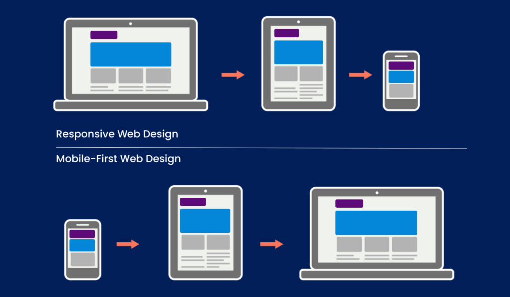
Best practices for clean, intuitive mobile menus and sticky cart features that users can navigate seamlessly.
Read Strategy
Troubleshoot and resolve website crashes or checkout breaks caused by installing incompatible Shopify apps or WooCommerce plugins.
Read Strategy